Hero Complex Case Study
GENERAL ASSEMBLY — DESIGN
Hero Complex Gallery
Delivering an Improved Ecommerce Blueprint
ROLES
UX Researcher
UX Designer
TOOLS
Sketch
InVision
Miro
TIMELINE
4 week sprint
Why design?
Hero Complex Gallery is an exhibition space specializing in contemporary and pop art in Los Angeles. The business wants to be more visible within its community and sees its underperforming website as an opportunity to expand potential reach beyond LA.
The GoalS.
Business
: increase webstore conversion and time spent on site
: drive in-store traffic around events and exhibitions.
Product
: establish HCGart.com as go-to resource for pop art sales or general reference through seamless paths to purchase and browsing experiences.
Before we begin, here is a walkthrough of Hero Complex’s current site.
What are your initial thoughts?
Do we share any theories?
1.1 RESEARCH
—DISCOVER—
Heuristic Evaluation
HCG’s site isn’t in a terrible state. It’s only when we dive deeper into the heuristics were we able to identify experience breakers that deterred time on site and path to purchase. For example, product descriptions and prices were not prominently featured, filter options were unavailable to help pull out desired items, and there were no credit card payment options offered.
Competitive Analysis
We also studied HCG’s competitors for inspiration - the focus was to pull in a wide comparison to see what the site was missing and which features we could further build on. Analysis included direct comparisons like Hauser & Wirth, aspirational like The Broad, similar scope like Secret Headquarters Comics, and industry giants such as Etsy.
Potential Opportunities.
: Local Pick-Ups & Reservations
: Interactive Calendar Builds
Let’s get some more eyes on this.
User Interviews
It’s time to go beyond my personal lens. What do others see in HCG’s site?
Usability Tests Conducted: 3
User Parameters: previously purchased art online
Task 1: purchase Howl’s Moving Castle poster
Task 2: purchase tickets to upcoming event
Listen in here. What did we learn?
Surface Takeaways.
: Search bar does not return items that exist on site
: Item descriptions are misleading
: Site paths are not intuitive
: Difficult to navigate between gallery and art for sale
: Shipping options are not offered at checkout
Data was synthesized further through affinity mapping to create these behavioral patterns.
: I value product discovery offline
: I value cost performance
: I value informed purchases
: I value in-home aesthetics
1.2 RESEARCH
— DEFINE —
Persona
After several user discussions and research iterations, we eventually meet Rachel, a digital native who loves watching gaming streams on Twitch and window shopping through Instagram. She’s nostalgic when it comes to design and aesthetics. She doesn’t like to buy on digital platforms and is willing to take the time to find the right piece from the right seller. She loves the hunt of finding unique products and being able to interact with the item.
Rachel’s Journey
Rachel remembers her coworker told her about HCG gallery and its product offerings, so she goes on to explore the page. As you can see, it’s a roller coaster of emotions which ultimately ends up in the abandonment of cart.
Feature Prioritization
Taking Rachel’s pain points into consideration, which features should we focus on? Keep in mind, our team is working with limited manpower and budget, so we’re going to gravitate towards the most cost and time efficient solutions for the time being.
The Focus Points.
: Enhanced filtering
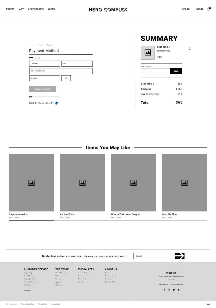
: Expanded payment options
: Local pick-up
: Smart Search
How might we help Rachel feel confident in her digital purchases while ensuring her design standards are upheld and met?
2.1 DESIGN
— IDEATE —
Information Architecture
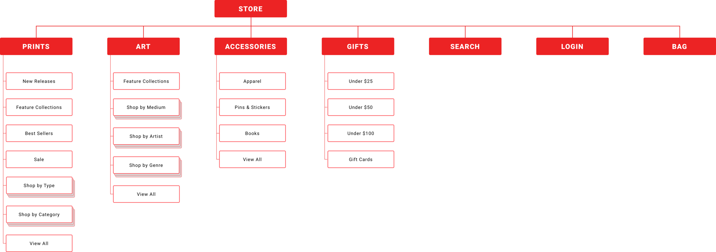
A common thread throughout our user interviews pointed to confusion around site categories. To get a better gauge on user organization patterns, our team conducted a series of card sorts - one based around general categories, one based around the art itself - to build an improved blueprint.
Original Site Map.
Primary Concern
Overwhelming and disorganized shop architecture
Store Map Solution Shown Above
The Split Solution.
The overlap between gallery and webstore bred category confusion for users. In order to keep our business objectives in tact and clarify the experience for customers, we partitioned the current site. One path focuses on the gallery and its events, the other focuses on web store operations only.
User Flows
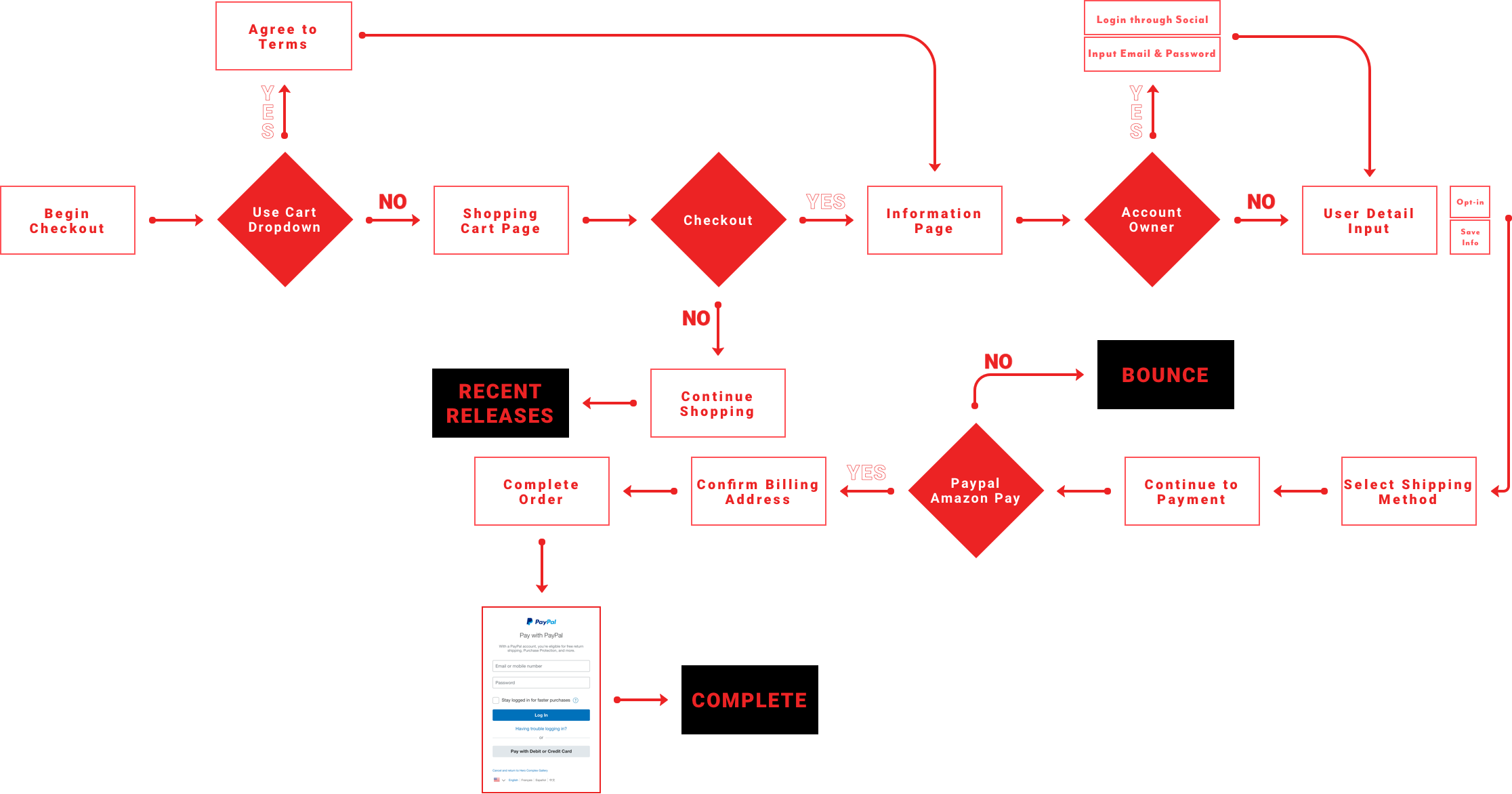
Alongside our site map work, we looked to solve one flow that raised concerns during task analysis tests: the user path to purchase.
Original Browse Path
Updated Browse Path
Problems Identified.
: Reduce decision making paths
: Compartmentalize product information
Solutions.
: Stripped down quick view feature
: Applied filter for quick personalization
Original Checkout Path
Updated Checkout Path
Problems Identified.
: Complex steps to purchase
: Payment barriers
Solutions.
: Applied guest checkout option
: Removed T&C’s agreement at start of checkout
: Directed cart dropdown to universal summary
With research and revamped processes in hand, we’re ready to shift focus to a tangible redesign.
2.2 DESIGN
— PROTOTYPE —
The design process starts now. Sketching ensues. Followed by paper prototypes and their accompanying usability tests.
Iterate.
from 3 paper usability tests, we noticed
: Filter tool is not prominent enough
: Added to cart indicator needed
: Placement of account login / sign up is not ideal
: Order of primary navigation items deters from webstore
Test Again.
with several tweaks, we pushed into medium fidelity for more tests
: Where is the user scanning?
: Where are the hesitation points?
: What tools need more context?
Iterate.
from 3 clickable tests, we noticed
: Architecture of filter tool needs further clarification
: Page spacing, font & object sizing need uniformity
: Search tool needs more accessibility
: Further differentiation between gallery & store sections needed
With a shell site created, how do we approach its visual identity?
2.3 DESIGN
— VISUAL CHOICES —
Branding the Gallery
The first impulse is to go crazy with color, typography, and imagery - we’re working with a funky and eclectic business, aren’t we?
So I made this pop-filled moodboard.
But I remembered back to our first user interviews, where individuals felt overwhelmed by the troves of content displayed. So, what’s a better solution?
Simplify & Let art speak for itself.
3.1 KEY LEARNINGS
— CHALLENGES —
Aesthetics over Process
I often found myself prioritizing interface over experience, which I soon found out, was the wrong way to prioritize my time. It’s hard to think of the user when visual identity is all you care about.
User Interview Bias
Interviews are difficult to conduct. My main issues revolved around bias and leading questions. Did I really extract accurate data? How do I detach myself from the work I’m testing?
User First
It’s a constant fight to remind myself who I’m designing for. Since this is considered a class project, I had difficulty removing my personal interest. But, if there’s anything that I’ve learned thus far, user over everything.
3.2 KEY LEARNINGS
— NEXT STEPS —
Gallery Focus
Now it’s time to shift some focus to the second business objective: drive physical foot traffic to in-store events & exhibitions. Let’s answer the question: how do we bring digital users to the gallery’s brick & mortar?
Continued Store Testing
My work isn’t complete with the ecommerce site. There are still multiple pathways that can - need - to be explored. At the end of the day, this site isn’t just one user flow, is it?


